aetna logo

A sweet solution for hiccups—and brand storytelling

Fusing science and art to make a health brand ‘pop’

Campaign development
Customer experience strategy
Design language system
Experiential design
Video & animation
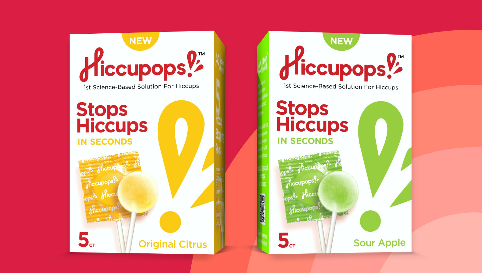
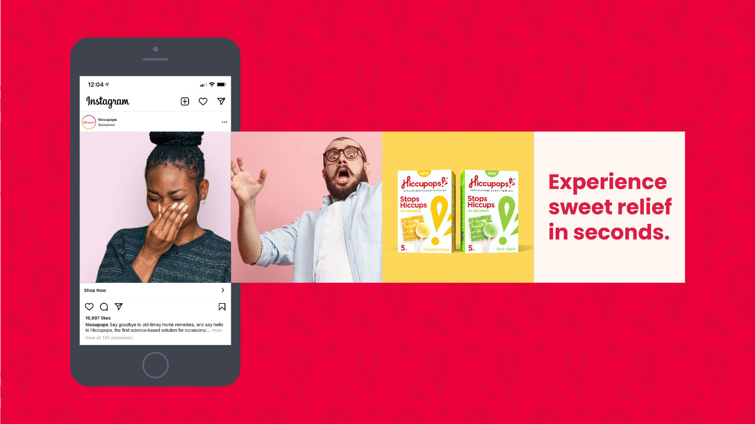
Two boxes of Hiccupops lollipops, a science-based solution for hiccups, with one box in yellow labeled Original Citrus and the other in green labeled Sour Apple, each showing a corresponding colored lollipop and text stating they stop hiccups in seconds with 5 count each.

Inside the rebrand of a hiccup-stopping health innovation

Ahead of releasing their signature product in retail pharmacies, Hiccupops™ needed to update the design and storytelling strategy of their website and social media. Using the existing brand mark and packaging as a launching pad, we developed an eye-catching brand identity and consistent, engaging brand voice that captured the efficacy and excitement of this unique product.

Capturing the magic while explaining the science

See how we BALANced emotion with evidence

Hiccupops are scientifically formulated lollipops that stop occasional hiccups in seconds. Parent company, Meter Health, conducted years of research, trials and patent certifications before putting their product on the market. But there’s also an undeniably cheerful aspect to the product and its purpose. For generations, hiccup “cures” were pseudoscientific folk remedies that didn’t work, so, it seems like magic that these ingenious lollipops actually do. Our task then was to showcase the astounding, near immediate effects of Hiccupops, without losing sight of the healthcare marketing science that made them possible.
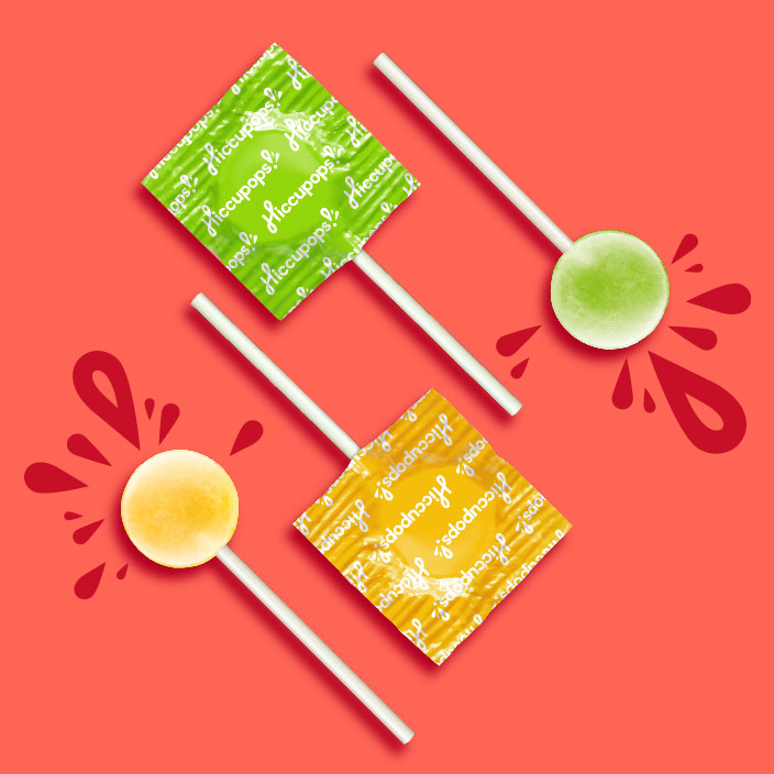
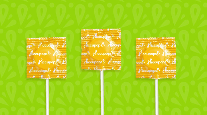
Two wrapped lollipops in green and yellow wrappers and two unwrapped lollipops in yellow and green with red splash graphics on a coral background.
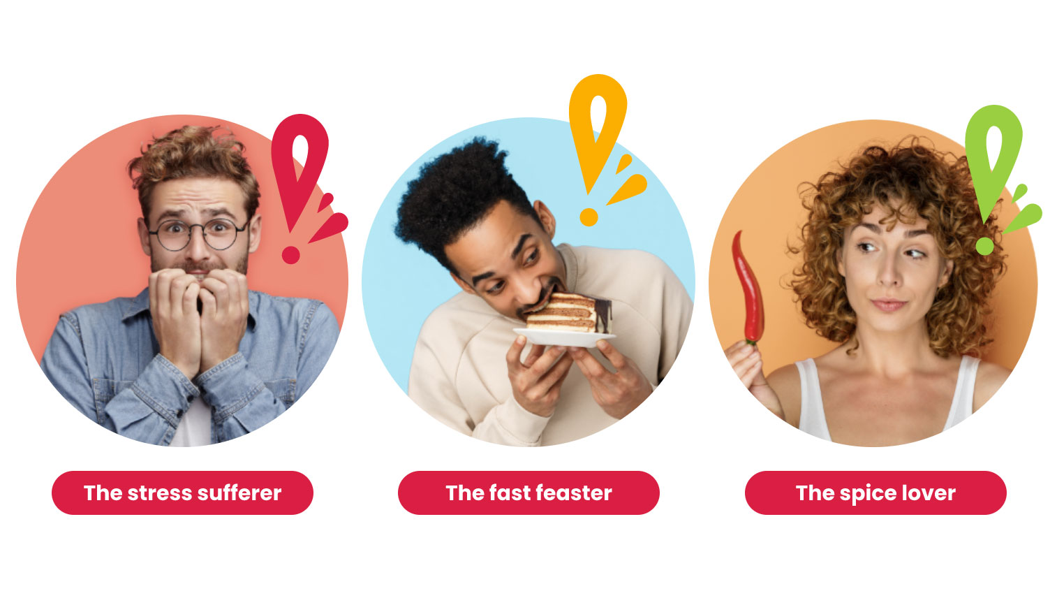
Three circular portraits against different colored backgrounds labeled 'The stress sufferer,' showing a worried man biting his nails; 'The fast feaster,' showing a man eagerly biting into a slice of layered cake; and 'The spice lover,' showing a woman holding a red chili pepper and looking sideways.

Establishing a brand voice and
using it to tell a consistent story

heart the voice behind the brand experience

Boosting the brand with an
elevated visual identity

Get a closer look at the design evolution

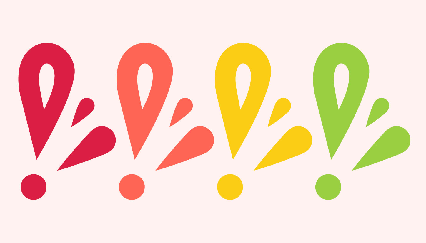
Four colorful stylized splash shapes in a row on a pale background, each composed of one large looped droplet with a pointed tip, a smaller teardrop shape, a medium pointed shape, and a circle at the bottom; colors from left to right are red, coral, yellow, and green.
This synthesis of creative strategy, visual design, copywriting and UX/UI design expertise helped us showcase Hiccupops as a modern and credible brand
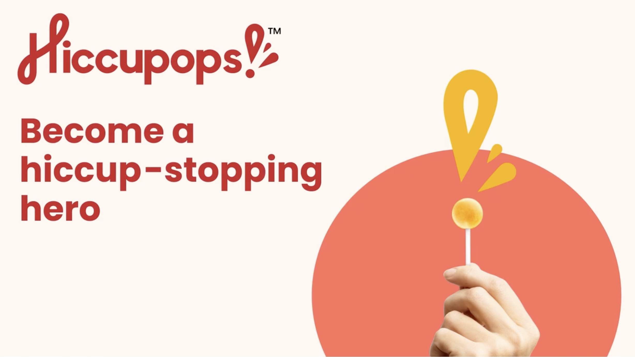
Hand holding an orange lollipop with an orange splash design above it and red text saying 'Hiccups! Become a hiccup-stopping hero' on a cream background.
“
Thank you so much—we love working with you guys!
Hiccupops
Chief Executive Officer